Marcelo Amorim
Marcelo Amorim (Goiânia, 1977) is a Brazilian visual artist whose works examine themes such as identity, politics, and society. In his work, Amorim deconstructs common and nostalgic elements, such as didactic images and book illustrations from the 1920s and 1930s, transforming them into powerful social reflections that illustrate problems arising from social constructions, even if those are sometimes unintentional. In this interview, Marcelo discusses the research process behind his artistic endeavors and the social constructs reflected in the images he chooses to reinterpret. Check it out:
Marcelo, I’d like to start by asking you to introduce yourself. Tell us a bit about yourself, about your artistic practice.
My name is Marcelo Amorim. I’m from Goiânia, but I currently live and work in São Paulo. I moved here at a very young age, just 17, to study publishing, focusing on books and magazines. I had the opportunity to work at the Paço das Artes Museum, specifically in the editorial department. It was there that I began to interact with the art circuit and put my own work into circulation. A very interesting aspect of my work is the connection with the idea of publishing, in which the editor is someone who explores a vast universe of themes, looking for what interests them. They highlight and give meaning to material by selecting, editing, and juxtaposing and the editor’s role involves a lot of “cutting and pasting” and even deleting content, which is very similar to the work of a curator
O meu trabalho começa sempre com uma espécie de pesquisa ou coleção de imagens, e eu vou tentando transpor essas imagens para outras linguagens, a fim de criar circunstâncias para a gente conseguir ver através desse material, que normalmente foi pensado com um objetivo original – para alguma coisa – mas que, por trás, tem algumas ideias. Parte do meu trabalho é tentar ver esse através, criar condições para que pelo menos o público tenha um estranhamento com aquilo, desnaturalize certas coisas, crie reflexões a respeito daquilo que eventualmente a gente deixou de ver, deixou de prestar atenção.
(Translation: My work always begins with a kind of research or collection of images. I try to transpose these images into other languages, in order to create circumstances in which we can see through this material, which is usually designed with an original purpose – for something – but which has some ideas behind it. Part of my job is to try to see through it, to create the conditions so that the audience is at least surprised by it, denaturalizes certain things, creates reflections on what we may have failed to see, or failed to pay attention to.)
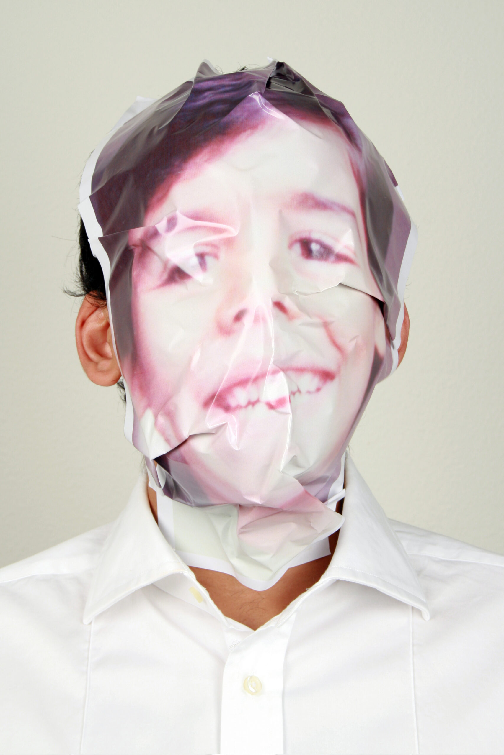
My work began with an observation of everyday photographs, such as domestic photos, amongst others. From there, I started to notice a kind of institutionalization of life: why are photos of birthdays, weddings, and travel always the same? I then began to expand my gaze beyond my own images and those of my family, exploring a wider, collective universe. I started looking at images in textbooks, advertising, and cinema. My search usually centers on images that are not so well known or a little forgotten and I rescue them, sometimes transforming them into drawings, paintings, or screen prints. If the image is a moving one, I turn it into a piece of video art. That’s more or less my approach.
How do you choose the colors you use in your work? For example, in your last exhibition, “Viragem”, you used a lot of red and pink, which are very vibrant colors. How do the color choices connect with the theme of the work?
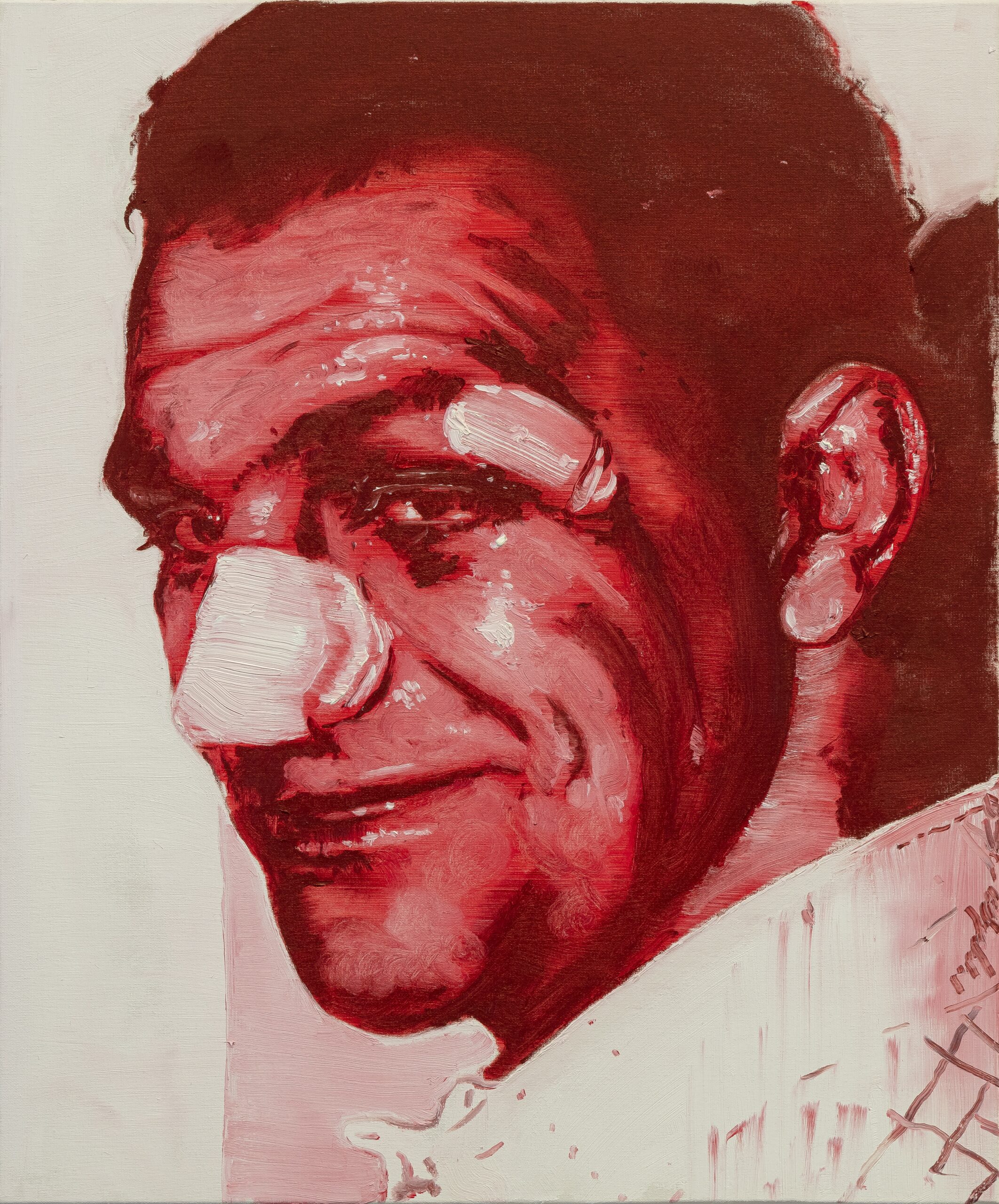
The source material gives me a lot of information. For example, the color palette I use in my paintings is very much related to the ageing of the photographs. As analogue films age some tend towards magenta, while others, depending on the brand, tend towards purple. This ended up becoming the palette for a number of works. For example, I once came across a very old photo made from silver crystal. Over time, the silver stands out and, depending on the angle, it glows, allowing you to see the image inverted, as if it were a negative. However, the photo is no longer completely silver, as it has become sepia-toned over time. As a result, it now has a golden color. This inspired a series of gold screen prints and oil paintings with a gold and white background. These works play with the game of seeing and not seeing, the positive and the negative, depending on the angle from which you look at it. For example, in the exhibition “Viragem” [on show from 28 August to 1o September 2023], this change came about almost naturally. I was working on a previous series using Indian Red to make portraits. This had to do with the fact that red, at least here in Brazil, is very much associated with the political left. But this color can also represent vivacity and violence, among other things. And I ended up incorporating this color into my landscapes. If you look at the original photos, you’ll see that they have a kind of warm sepia tone. This somehow suggested the use of red to me. When I organized the exhibition, I made some interesting developments. I hadn’t considered it much at first, but a curator friend mentioned that the sea in Rio de Janeiro was the entry point for slaves, and that made me think of a red sea, a sea of blood. This led me to think about what it would be like to represent a red sea, since we usually represent the sea as blue or green. In this way, it’s strange to see all these landscapes transformed. The name “Viragem” refers to a chemical procedure used to change the color of a black and white topography to a monochrome tone. Depending on the chemical used, the color can change to violet, sepia, or red. In addition, the name “Viragem” has an echo; it reminds me of a mirage, a landscape and is a very important reference for me in relation to photography. Most of the paintings I make depend a lot on photography and come from observing it.
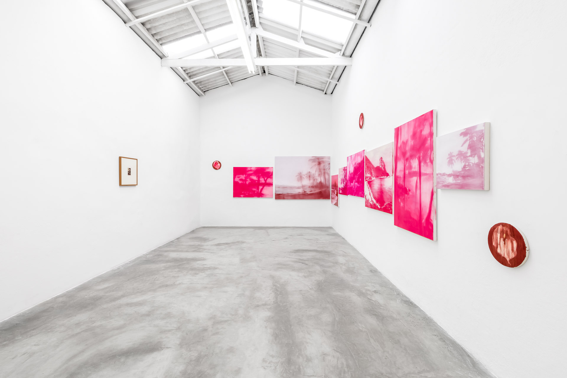
Massapê, Brasil
Observing characteristics of other media, such as photography, it seems that your paintings have a particular dealing in terms of colors and palettes. While painting generally explores a wide range of colors and can be an end in itself, you bring elements of photography and the effect of time on photographic material, into your works. With this in mind, would you describe your paintings as conceptual?
I do see my paintings more as a conceptual process. Even though nowadays I have a genuine interest in the painting itself, details of the painting have become more interesting to me. However, the first series were absolutely conceptual, especially because we tend to associate photography with a document, as a form of truth, since it seems to have captured the light of a real scene. We therefore tend to consider photography as a reflection of reality and painting as a product of the artist’s imagination. For example, if a photographer records a war, the war looks horrible, and the photographer is exempt.
Mas, se um pintor faz uma imagem horrível, muitas vezes ele é apontado como uma pessoa horrível ou alguém com interesses perversos. Porque a imagem veio da imaginação, foi uma criação dele. Esses deslocamentos me interessaram, como pintar uma imagem decididamente persuasiva, que mostrasse um comportamento. Quando você olha a imagem, ela se disfarça. Podemos até lembrar que foi encenada, mas, de alguma maneira, por ser uma foto, você acredita que aquilo aconteceu. E de fato aconteceu. Mas, se você pinta, revela essa construção de um jeito mais óbvio, mais gritante.
(Translation: If a painter makes a horrible image, he is often singled out as a horrible person, or someone with perverse interests. Because the image came from his imagination, it was his creation. These shifts interest me, like painting an image that is decidedly persuasive, that shows a type of behavior. When you look at the image, it disguises itself. You can even remember that it was staged, but somehow, because it’s a photo, you believe that it happened. And, indeed, it did. But if you paint, you reveal this construct in a more obvious, more blatant, way.)
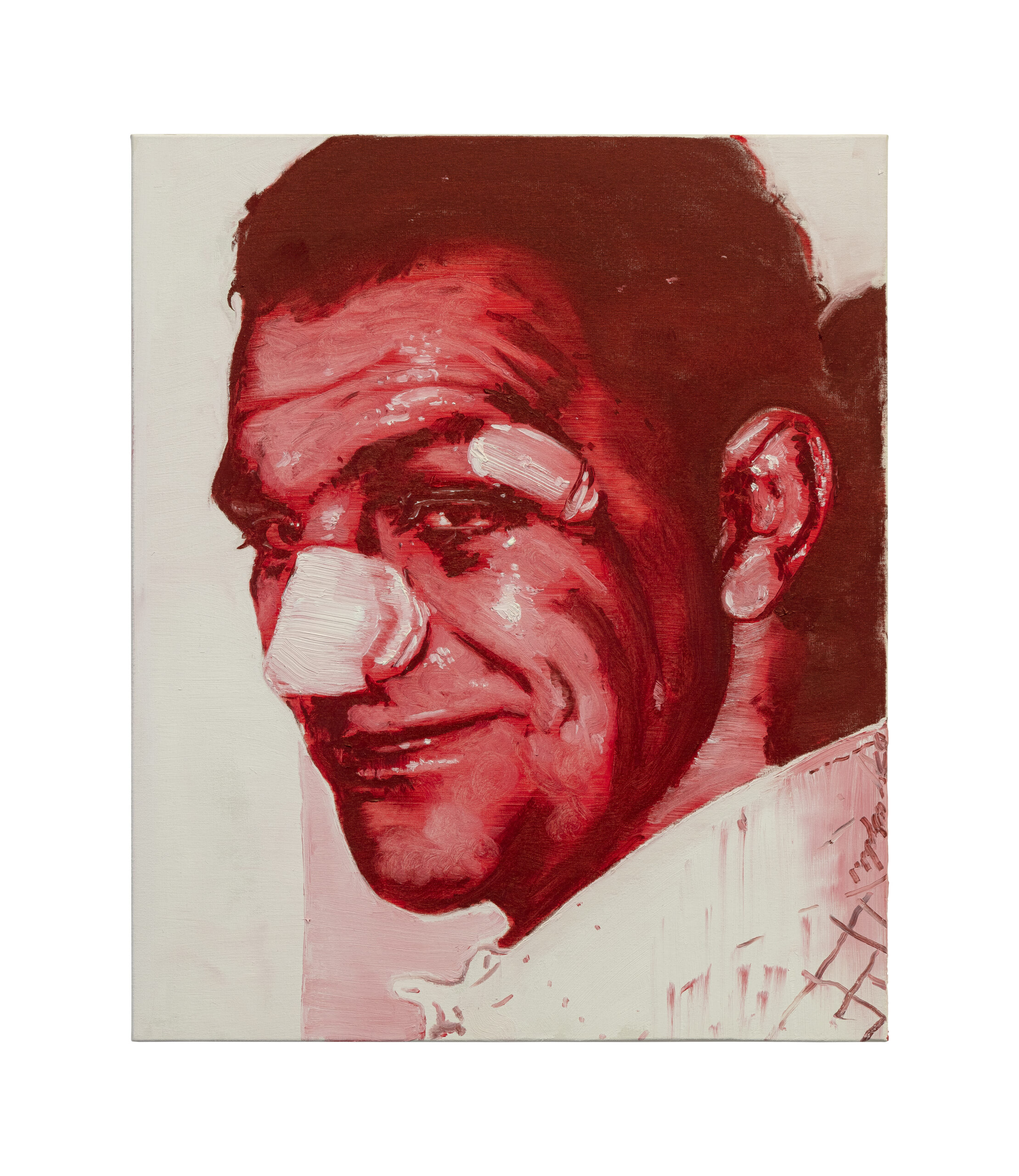
That was one of my first intentions. Now, there is also a lot of my painting that uses a kind of collage procedure. The different fields of monochrome tones begin to coexist, creating an illusion of color, and this leads me to discussions that are closer to painting. However, my discussion was never really about painting in the sense of layering, or chiaroscuro, or colors. It was always more about a collection of images, about a subject. With the exhibition of landscapes, as the subject is more neutral, painting became more visible. Because if you’re painting a portrait or an image, like my series on masculinities, which features a boxer with a swollen face or a scene of bullying, the viewer’s attention is captured first by the subject. I’ve had feedback on this exhibition of landscapes, especially in relation to painting, about how it was made, how it looks.
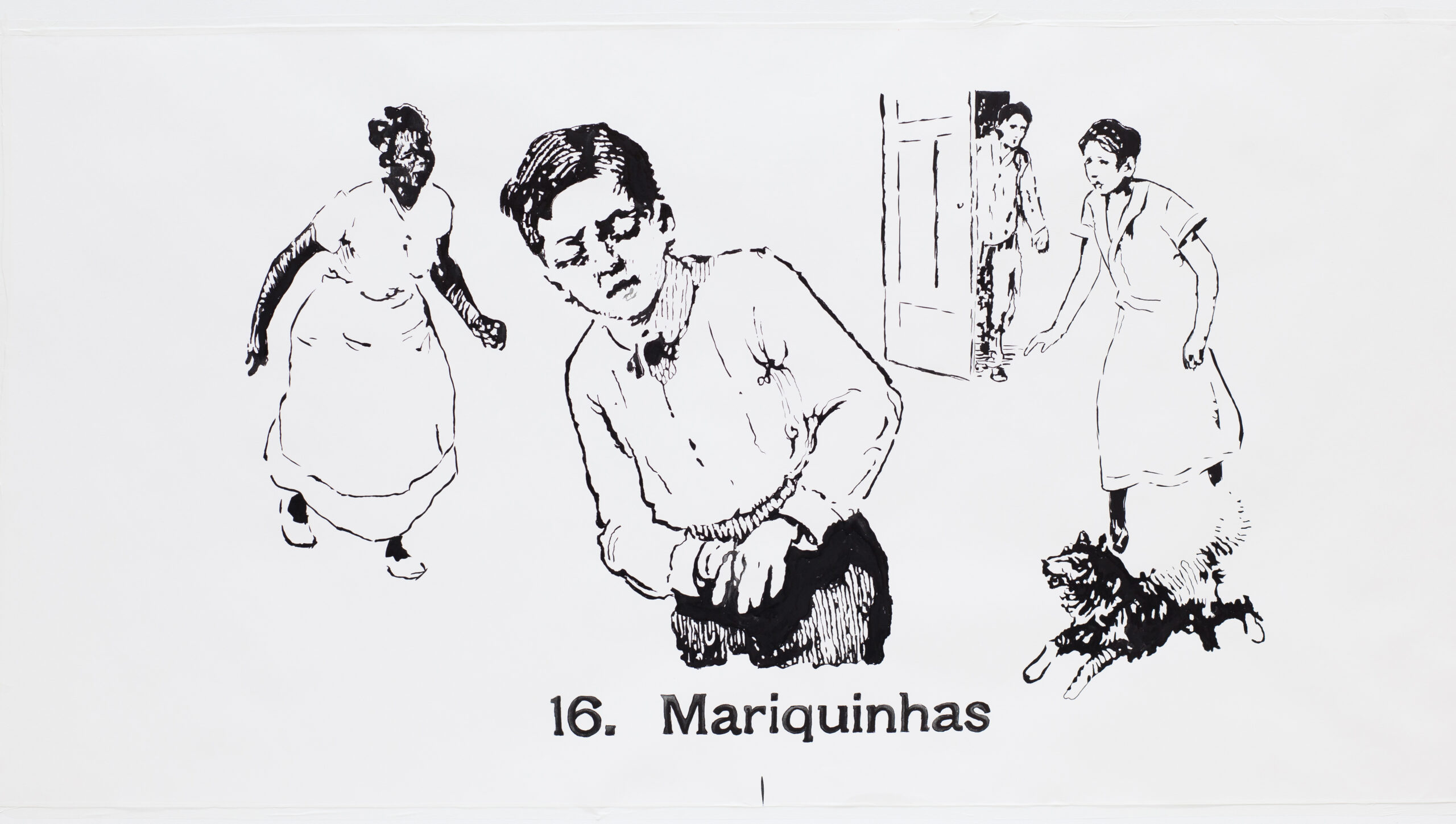
You mentioned changes and displacements. That reminds me of your “Escola Normal” series, in which you research textbooks and teach drawing, focusing on Brazilian books from the 1920s. You mix painting, serigraphy, and drawing, and use an almost cartoonish style. How did you go about taking these images and adapting them to your own painting style? Because they already exist in the world of children’s books.
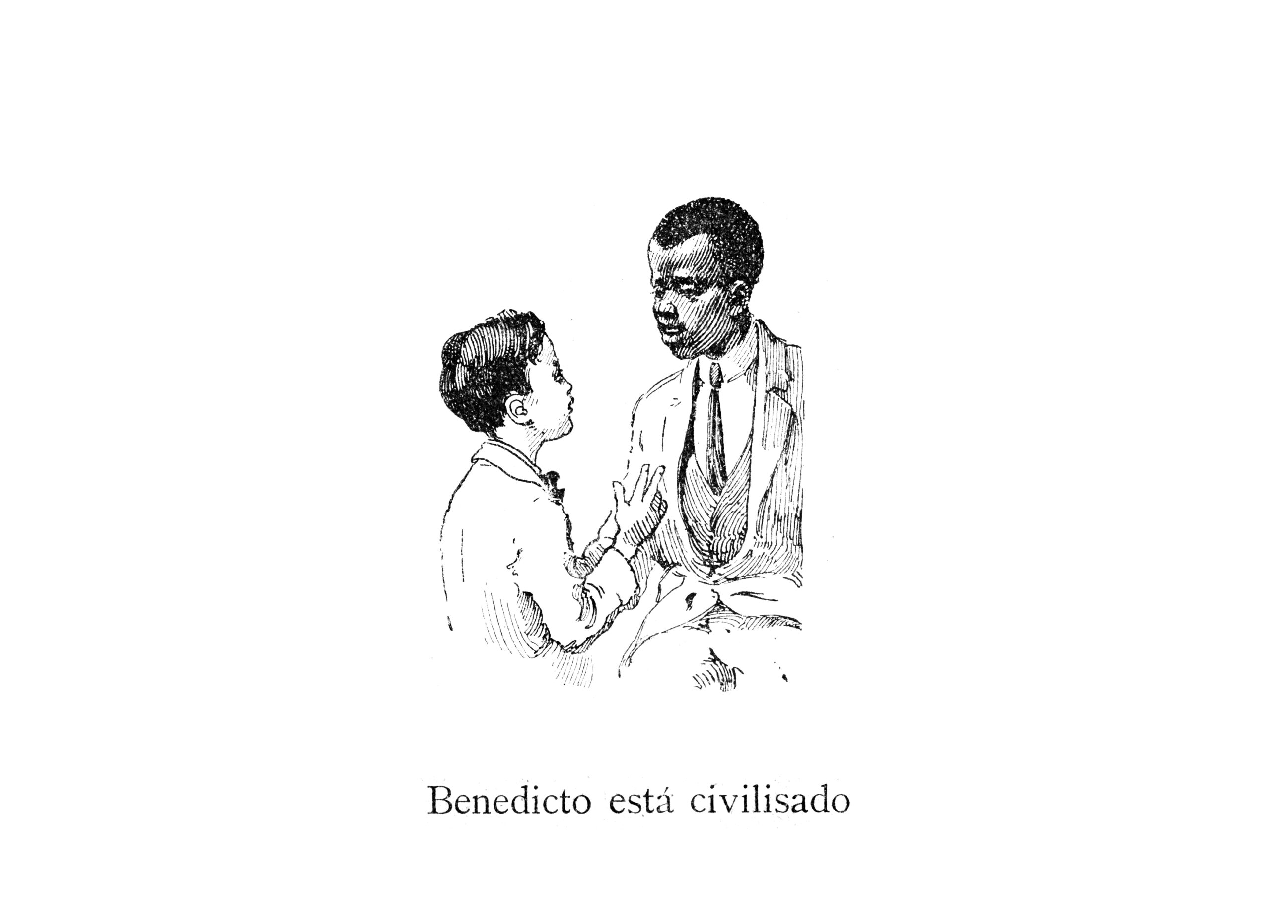
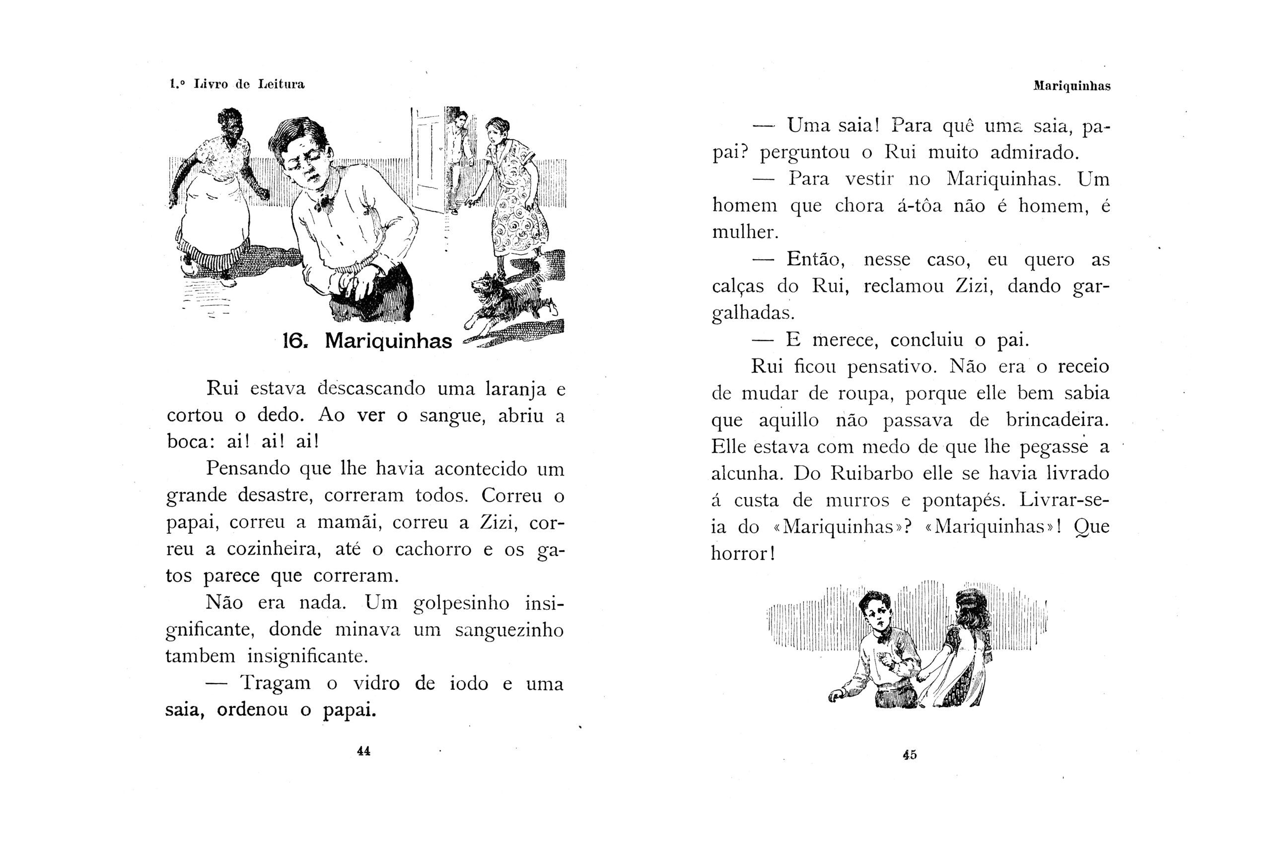
I was in Ribeirão Preto, staying with a friend who was cleaning out her house after her grandmother died. She allowed me to pick up some books and I ended up finding some old primers. What struck me was the quality of the illustrations, which were engravings that were very well done. When I started reading, I found some shocking things. For example, a lesson called “Mariquinhas (The Sissy)”, in which a boy cuts his finger, and his father says “Get Mariquinhas a skirt, because a boy who cries is not a man, he’s a woman.” I decided to recreate these illustrations in a larger format because, by increasing the scale, its horror becomes more apparent. Even the illustrations showing children playing with animals, when enlarged, become strange; the idea was to make it more visible. In addition, I was interested in the idea of copying, because in art and at school we are taught to copy, whether it’s a drawing by great masters or in a lesson. This copying was something that intrigued me, that it wasn’t exactly mine, but it looked like it was, existing in that grey area of whether I created it or not.

I think the scale and isolation of the content cause a certain strangeness. It’s hard to identify, but when I saw the series, I realized it came from a children’s book, or textbook, because it reminded me a bit of the same aesthetic I saw when I was studying. Have you ever been asked questions about the origin of these images?
I have a series that is inspired by Brazilian books that begin in the 1920s, with a certain type of image. There’s also another series, taken from books that marked my childhood, that have a very North American look – they’re a reflection of our colonization. My childhood was in the 1980s, but the images in these books, created in the United States in the 1960s, arrived in Brazil late, so I was consuming images that dated back to the 1950s and that’s something you can recognize. Often, certain traits reveal an editorial origin. Some things, like a caption left over from a page, or a page number, are common. When I work with screen printing to digitize them, many dots appear because of the printed image. When you zoom in, you notice the four-color dot, the offset, and you realize that it was printed. Some of these clues remain and show their origin. I find it curious that, as my first works were of my childhood photos, many people asked me if it was me in the image. I created a series with boys practicing physical education, and many believed that I was portraying my own experiences at school. I found this confusion interesting. However, the truth is that nobody is usually photographed, or photographs themselves, during physical education (laughs).
Aquilo era um livro didático para ensinar as crianças a fazer certas atividades e que continha jogos de poder muito cruéis e estranhos, do meu ponto de vista. Era isso que eu queria trazer. Ao longo do tempo, sempre houve muita confusão sobre se aquilo era meu ou não, sendo que eu trabalho com apropriação. Desde o início, a opção de encontrar uma imagem está presente em quase tudo que eu faço.
(Translation: That was a textbook to teach children how to do certain activities and, for me, it contained very cruel and strange power games. That’s what I wanted to bring back. Over time, there was always a lot of confusion about whether they were mine or not, since I’ve been working with appropriation since the beginning. The option of finding an image is present in almost everything I do.)
During your research, do you also analyze contemporary materials and books?
Actually, the most recent books aren’t really the focus of my research. There was a time when I captured images of all the absurd things that were happening in the field of education on Twitter. However, I find it difficult to deal with the visuality of the present.
Marcelo, I’d like you to share any challenges, difficult moments, or hardhips you’ve faced while researching or creating your works, or any obstacles you’ve encountered throughout your career.
Starting my artistic career in Goiânia was quite challenging. For artists who aren’t from big centers like Rio or São Paulo, the options seemed to be, either leave your city and move to these larger urban centers or stay in a more restricted environment. When I started, the internet didn’t exist yet. Even today, although you can reach a wider audience online, it’s difficult to fully show your context from a smaller town. This can leave you feeling a little out of place, as the poet Drummond de Andrade says: “You want to go to Minas, there is no more Minas”. Once you leave your city, it’s as if it no longer exists for you. It was also a challenge for me to give up certain things to pursue my work, mainly because I didn’t have a full understanding of what art is and what was going on. My background in media influences my way of thinking a lot, especially in terms of editing. In the beginning, I used semiotics and the hand as a tool to understand things better. Working in São Paulo when coming from outside the state was also a challenge, I’d say. But after starting at the museum and meeting some people, I began to understand my path better. The situation of young artists trying to break into the art circuit had such an impact on me that I dedicated a lot of my time to facilitating it. So, working in independent spaces, with classes, guidance, I created meeting points to help those who are lost to get in touch, giving an artist’s talk on how to do research, how to prepare a portfolio, and how to apply for a public notice. In my day, there was no place to turn for help, no one to turn to. In my family, when I said I wanted to study visual arts, there was a huge fear that I wouldn’t be able to support myself. Although I had wanted to study visual arts since graduating, I ended up opting for another course, which seemed to offer a better chance of survival. I worked as a designer, editor, and editorial producer until I was able to devote myself to my work. And that was a big step down. It took me a while to have a solo exhibition with my name on it. And this kind of work, which requires a certain closeness, a kind of research to understand the artist’s universe, ends up circulating less. If we’re discussing themes such as gender, or masculinity, we seem to be restricted to a niche. Being Brazilian, or Latin American, also brings its own issues. In the eyes of the world’s major centers, it seems that our role is to meet their expectations. As a result, a Brazilian painter is elevated to world fame if he is colorful, reminiscent of samba, caipirinha, or violence, trafficking, always meeting others’ expectations so that we can participate in this global circuit. As a Brazilian Latin American, from Goiás, it seems that I can’t tackle a broad topic like suicide, I have to talk about being Latin, from Goiás, from Brazil. That seems to be my role. And my work isn’t extremely colorful or extremely happy, it doesn’t meet the expectations of what a Brazilian artist should be, and so you end up in a specific, niche place.
Yes, we have great Brazilian artists who are recognized worldwide, whose work is described as tropical. Speaking from a European perspective, I think there is an interest in getting away from this expectation of what Brazilian work should show. However, at the same time, there is a difficulty of access. You’ve described all the effort and dedication it takes to create contacts and position yourself in a place. Imagine doing all that again, but having to think about being in other countries, like Germany, the UK, Italy, etc. The world is now reaching a moment where there is a lot of access and a lot of goodwill, but we still have to resolve the barriers. On the subject of painting, how do you see the relationship between someone who comes across a work outside the exhibition environment, without many details about the research that gave rise to the image they are confronted with?
It’s also a challenge. When I did the exhibition at Marp, I had an entire floor of the museum. Each room was divided into physical education, playground, drawing room, and classroom. We planned a very nice educational program, and I received very interesting feedback from people who aren’t specialists. We did a lot of work with the teachers, as we were coming from a time of a lot of violence against museums and they had stopped taking their students because of rumors circulating about parents not wanting to take their children to museums because there were too many inappropriate subjects. I got feedback that the work was very accessible. People are enchanted by that initial layer of nostalgia and beauty in children’s illustrations. They connect with these images, which seem familiar, and then they start to realize the problems. To welcome the schools, we set up a table in a room where everyone could sit down and read a lesson from the old 1920s primers. This made people start to be a little more wary of images, and it worked. I remember a gallery owner saying that my work was difficult to present at a fair because it needed a context to make sense. Sometimes, at a fair or group exhibition, your work can be next to others that have no relation to it. Some works seem to have a kind of autonomy, they manage to resolve themselves, but I like to work with the idea of juxtaposition. If I’m asked for a work for a group exhibition, sometimes I’m asked to put two together, one contrasting with the other to create tension. At the end of the day, I believe that sometimes aspects such as scale and color can already provoke a certain strangeness or distrust.
It’s interesting to think that in creating the work, when you change the size, color and location, the viewer is trying to understand the image with the tools they have. If we think of children’s books from the 1920s, perhaps older people connect with the image itself because of the aesthetics. But younger people may connect with the reproduction of the print form, because they can see that the image is not digital, but analogue. This ends up creating a sense of familiarity.
Yes, I usually leave a few hints. For example, I had a large solo exhibition at the Ribeirão Preto Museum called “Normal School” [on show from 16 February to 10 April 2019], in which I put together several series about the school. In the room with the illustrations from the 1920s, there were also photos of children from Colégio Caetano de Campos, from the 1930s, doing physical education. If you look, the clothes are very similar to those in the illustrations and if you compare them, you can determine certain eras and ages. It’s interesting what you said about the book that you were given. Often, the book we receive at school follows many guidelines. We don’t choose the book ourselves, nor do our parents. Sometimes we settle for what’s available. We grow up with certain images and,, somehow, they become part of us. But what is considered right and ideal? When we think about the structures of Brazilian textbooks, we see a traditional family: father, mother, a boy, and a girl. However, the boy is always the main character. The girl, her parents, her grandmother, are all secondary to the white boy. Education seems to serve to keep the elites in power. This material is not aimed at a black boy. In Brazilian textbooks from the 1920s, the black boy is portrayed as a stranger. In the primers I analyzed, all the black characters are called Benedito or Benedita and are always related to backwardness and mysticism. What is the effect of this for those who don’t see themselves as the protagonist? How is this information internalized? In an edition published in the south-east, but distributed throughout Brazil, they mentioned the boy from Ceará who lived very far away. The lesson highlighted the Southeast as the center and said that the boy’s town didn’t appear on the map because it was too far away. The boy was sad because he felt his beloved city had been forgotten. This makes me think of Goiânia, my city. Few people know about Goiânia. We end up absorbing representations of an ideal in the media, like in films. In Brazil, this ideal profile is often of a white, upper-middle class child from Rio or São Paulo.
When you think about the presence of teaching materials, they end up emphasizing the perversity of these statements and the teaching structure. It’s one thing to talk about films or soap operas, which, even though they are part of everyday life, no one is obliged to consume, allowing a certain distance from these supposed truths, if we so wish. But when we think about school and young children, especially in the learning literacy period, the problem becomes clear; these statements tend to become truths. And that’s not even the point. In literacy, the aim is to learn syllables, verbs, but suddenly we are faced with these social “truths” that cause a social problem, when the intention should be to focus on grammar, literature.
Yes, these things slide between these interactions. In an exhibition I did at the Zipper gallery, there was a piece that said “Snow is white” with an image of a small sheep. In another, the phrase was “The glutton is a bad companion”. Perhaps it was a lesson in learning colors, I don’t know, but behind this, there are various statements that can be homophobic, racist, xenophobic and which are then internalized. I have a book called Escola Normal (Normal School), from which I have mined various lessons, especially from a collection called “Proença” by Antônio Firmino de Proença, who used his books to teach literacy to thousands of Brazilians. I’ve separated out some sections, such as Mariquinhas, Benedito, and the boy from Ceará, but we also have the theme of urbanity, where anyone who isn’t in the city is considered a redneck. There’s a lesson that says that education is the new nobility, but it’s not accessible to everyone. And then there’s jingoism in this fixation Brazilians have with green forests, waterfalls, and so on. This was all a government construction at a time when they needed to create a national identity, and these values were put into people’s heads through textbooks. When I was editing this book, Brazil was at the height of Bolsonaro and sometimes I would see a statement from Damares on Twitter that was very similar to the book. Sometimes people say, “But that’s in the past, we’re over it,” but we understand that, in fact, we’re not. This historical distance allows us to realize how absurd it all was, but this madness is still very close to us and we often don’t see it.
The question of influence is still much debated. And your research shows this very clearly. Even if it doesn’t start with education, it’s certainly perpetuated through childhood education and with these prejudicial values.
In the case of masculinity, for example, we understand that toxic masculinity is the root of oppression against women, gays, and black people. The process of forming this type of man continues, and the boy is often the first victim of this oppression and, later on, becomes an agent of oppression. This is a persistent reality. Part of my work consists of investigating key historical moments and images, which have become repetitive clichés that we still consume today.
Interview conducted on 14 November 2023 remotely via Zoom.
Oil on canvas I 50 × 60 cm
2020

Exhibition view of Viragem, at Massapê Projetos, São Paulo
Inkjet print on cotton paper I 70 × 100 cm
2018

Acrylic and watercolor on paper I 150 × 200 cm
2014
Acrylic and watercolor on paper I 150 × 200 cm
2014
Inkjet print on cotton paper I 100 × 70 cm
2008